FinanceRisk
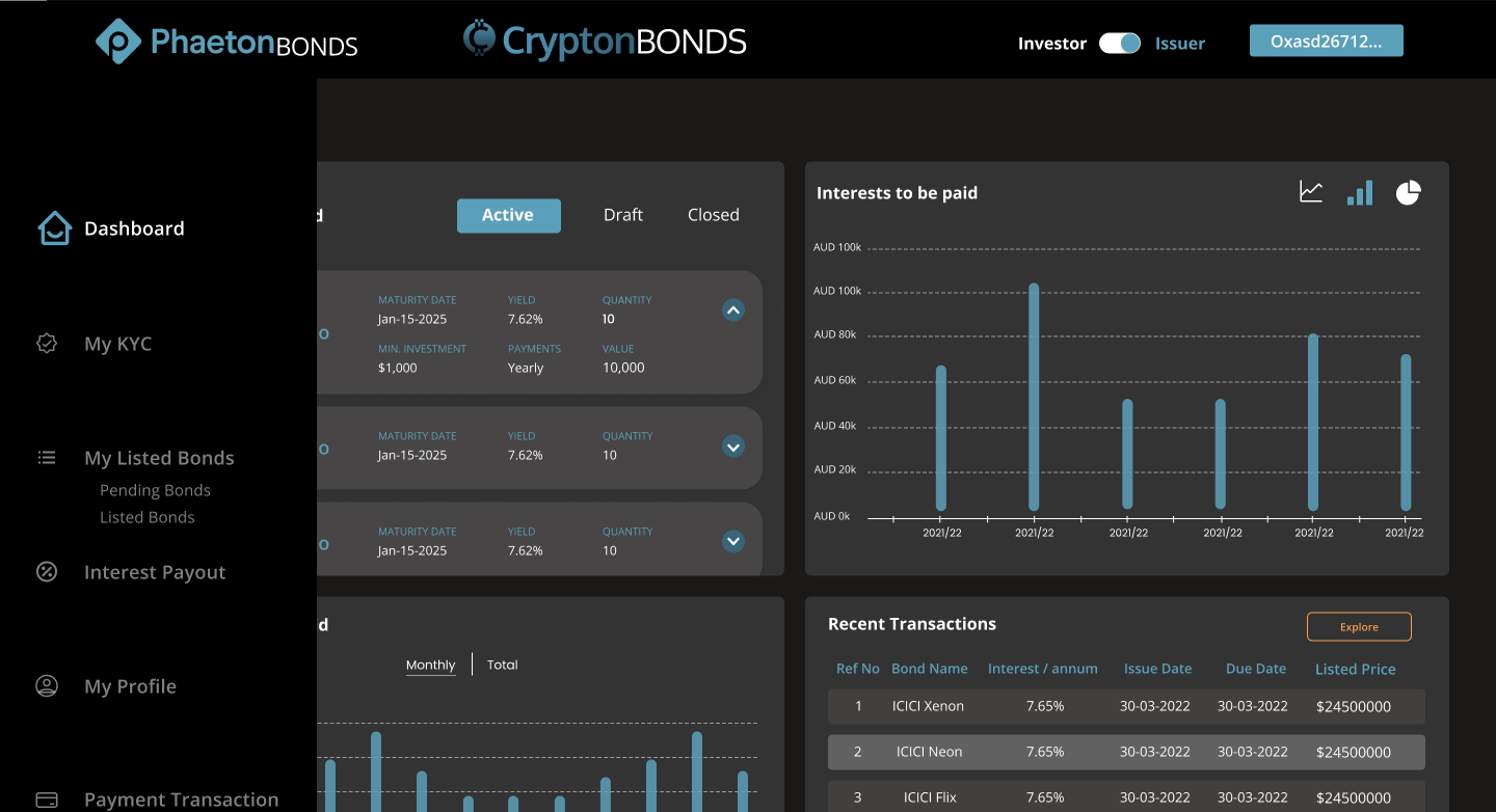
Crypto Bond Exchange
Guardrails and transparency for complex financial UX.

Hi, I’m a Product Designer
Explainable, Measurable, and Kind to the Bottom Line.
Principled craft. Measurable outcomes. A little magic.
Guardrails and transparency for complex financial UX.
From chaos to clarity—schema, lineage, and performance built in.
Designing for high-stakes moments; fewer taps, fewer errors.
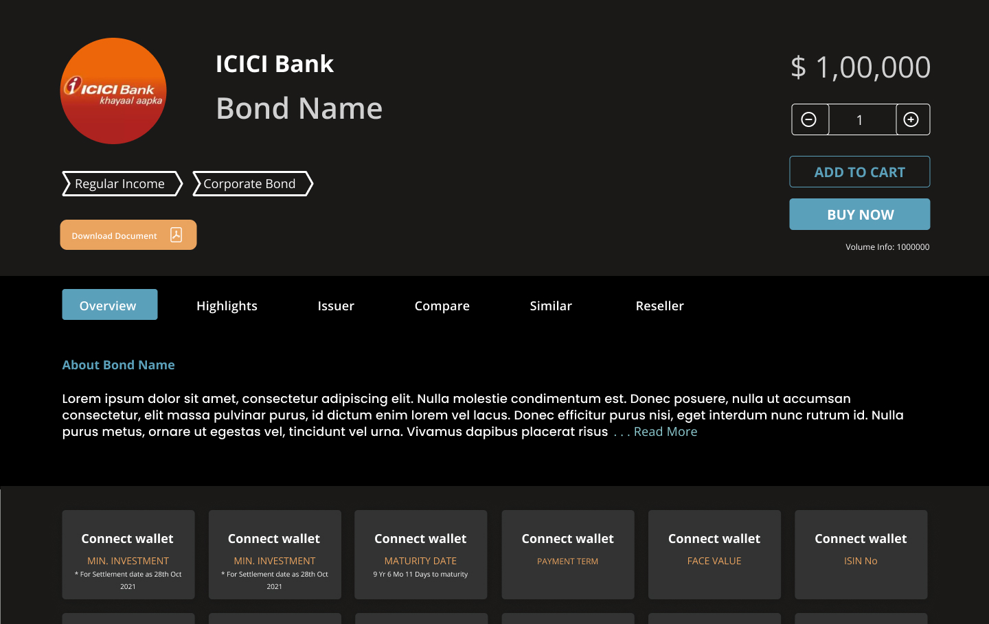
Guardrails and transparency for complex financial UX.

Tiny answers. Big clarity. Click a question—Chillbot blinks and answers.
She pick one high-leverage flow and ship a thin, real slice. Targets: +7–10% task success, −20–30% time-to-complete, −15% related tickets. You’ll see a live dashboard and a weekly decision log. No confetti until the graph moves.
Transparency first: citations, uncertainty levels, and a clear edit/undo. Human handoff is always one tap away. We monitor quality, latency, dissatisfaction—if the model’s guessing, the UI says so. Helpful, not clingy.
Frame the outcome and constraints → talk to 5 users/stakeholders → map JTBD + a system diagram → build two scrappy prototypes with success metrics → run n=5 tests → write a one-page decision (keep/kill/iterate) → ship v0 with logging. Small loops, fast learning, grown-up decisions.
Start with a11y tokens (type/contrast/spacing), a keyboard map, and screen-reader labels baked into components. Add a 15-minute SR smoke test each sprint and track a11y bugs per screen → 0. It’s a design input, not an afterthought.
Produce a 1-page domain map (actors, regs, risks), a glossary, and 3 quick shadows/calls. Write down red lines—what we mustn’t break—then sketch a system diagram and top hypotheses. By hour 72, we’ve chosen a testable slice, not just learned new acronyms.